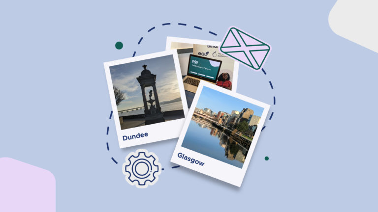
Swapping Webinars for Winter Sun: A Scottish Adventure
It’s great to get in front of ‘real’ people at an in-person event and have discussions that may not be as easy to have online during say a webinar of over 100 attendees.

There comes a time in every business’ life when a rebrand needs to take place. As a business evolves, the original branding may not reflect the business’ new personality or direction. A rebrand can be a subtle tweak, a new logo or even an entire overhaul to fully represent the business’ new brand identity. A full brand overhaul can reinvigorate a brand, giving it a new lease of life! It can often feel like a rebrand happens overnight. However, there are many factors to be considered and discussions to be had before the final reveal. Something we are well aware of as the eagle eyed among you may have noticed we’ve recently gone through our own rebrand.
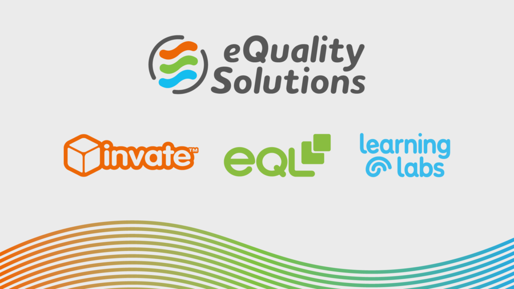
At the beginning of 2021 we announced our mission to be recognised as the no.1 UK provider of cognitive disability, diversity, inclusivity and mental wellbeing solutions, as well as an employer of choice, all by 2023. One way we plan to achieve this is through merger and acquisitions. In January 2021 eQS acquired Amano. You can read more about this here. Prior to the Amano acquisition, the eQS branding brought together elements from the three eQS sister companies, Invate, eQL and Learning Labs to form one logo.
With Amano joining eQS our design team incorporated the Amano colour palette into the eQS wave and altered the logo slightly to no longer include each company’s colour.

However, we asked ourselves “how would this work as our business portfolio grew under the merger and acquisition strategy?” It became obvious that eQS needed a broad brand that acted as an umbrella identity for all.
You’re on a webpage that’s using our new branding so it’s no secret what the final branding looked like. But how did we get to this end point? To reflect its ambitious growth plan, eQS needed its own unique identity, separate to its company brands, in order to convey gravitas and achieve longevity.
Our design team set about creating a selection of entirely new logos, some of which you can see below.
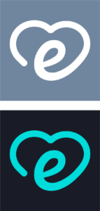
It was agreed that none of these logos strongly encompassed our values of equality, wellbeing and accessibility. We therefore kept our logo and soft, wave style, only one step away from the innovation before, and reinvented it into a logo that would stand the test of time as more businesses joined the eQS team. But how does this new branding reflect accessibility, equality and wellbeing?
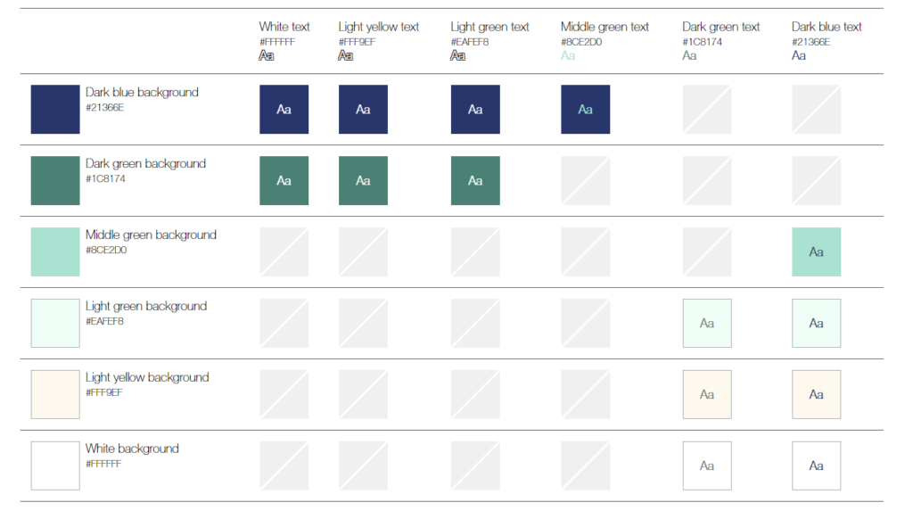
As a company that specialises in disability, diversity, inclusivity and mental wellbeing solutions it’s important that our branding can be enjoyed by everyone. We therefore ensure all our branding is is a clear simplistic style to avoid any distractions and includes bold thick lines so the logo can be visible at any size. It is also important that the contrast of background and foreground colours follows the WCAG guidelines.
WCAG stands for Web Content Accessibility Guidelines. Click here to find out more about WCAG.
The image below shows our colour palette as backgrounds down the left-hand side and our text colours along the top. Any background colour and text colour combinations that are WCAG compliant are shown in the image below. Only colour combinations that are WCAG compliant will be used in our branding, e.g. dark blue background and white text.
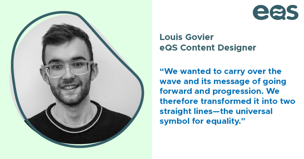
Equality is at the centre of everything we do, it’s even in our name. It’s therefore important that this is reflected in our branding. We also wanted to carry over the wave and its message of going forward and progression. We therefore transformed it into two straight lines – the universal symbol for equality.
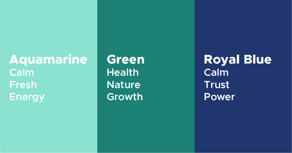
When you hear the word ‘wellbeing’ what do you think of? For us it conjures up imagery of health, a positive wellbeing and calming colours. It was important our new brand colours reflected this but at the same time portrayed the loyalty and authority we have established over time. As we had decided eQS needed its own unique identity, separate to its company brands, when it came to colour, the possibilities were endless. Similar to logos, our design team considered several colour options. Some of the considered colour palettes are shown below:
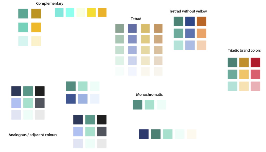
We decided upon a shade of teal called aquamarine and a darker shade of green. Aquamarine is associated with calmness, freshness and energy and the darker green is known for health, nature and growth.
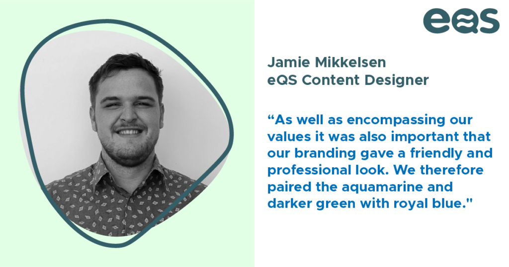
As well as encompassing our values it was also important that our branding gave a friendly and professional look. We therefore paired the aquamarine and darker green with royal blue.
In July our branding was put to the test when our second acquisition took place and equality, diversity and inclusion consultancy, EW Group, joined eQS.
By having a broad brand that acted as an umbrella EW Group seamlessly slotted into the rebranded eQS group.

It’s great to get in front of ‘real’ people at an in-person event and have discussions that may not be as easy to have online during say a webinar of over 100 attendees.
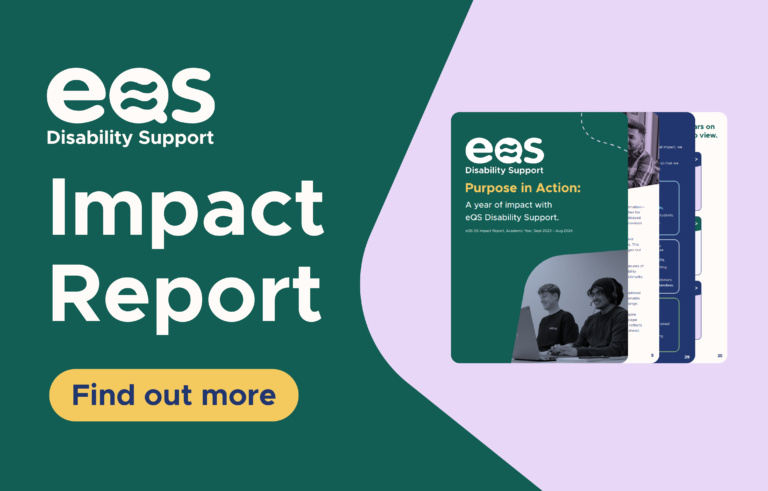
Purpose in Action: A year of impact with eQS Disability Support. eQS DS Impact Report, Academic Year, Sept 2023 – Aug 2024. Download the report. Our year in numbers Here’s
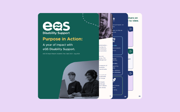
The release of our first-ever Impact Report is our statement of intent. We invite you to explore the report, share your thoughts, and join us in shaping a more inclusive future.